Company
Teladoc Health
Year
2021
Duration
9 Months
Industry
Healthcare
The New Teladoc Health
Teladoc Health had acquired several companies during the pandemic (BetterHelp, Livongo, MyStrength, and others), each with its own app, visuals, and UX conventions. The corporate rebrand introduced a new identity, but none of its principles had been translated into product. Users were forced to jump between multiple disconnected apps, and the experience lacked cohesion, clarity, and trust.
Project OneApp was created to consolidate these products under a single unified experience. My job was to define how the rebrand should live inside this new ecosystem — shaping the visual language, interaction patterns, and product expression that would scale across a wide range of medical and wellness use cases.


Challenge & My Role
Teladoc’s rapid expansion left the product ecosystem fragmented. The team set out to build a unified, trustworthy, and scalable product experience with Project OneApp.
This led to my 3 core contributions:
Part 1. Developing a custom illustration system
Part 2. Auditing and improving key components & micro-UX across the app
Part 3. Creating a scalable icon system with accessibility in mind
All Responsibilities
Audited the existing multi-app ecosystem to identify UX risks, inconsistencies, and opportunities
Designed a custom illustration system to replace generic stock art and reflect the new brand’s principles
Redesigned key components including allergy cards, loaders, progress indicators, and motion cues
Built a cohesive icon system aligned with the new illustration style and strict accessibility requirements
Collaborated with brand, engineering, and product teams to align on a single, scalable illustration system
Part 1
Developing an Illustration System for the Rebrand
The existing product relied on generic stock art that didn’t reflect the new brand or the humanity of healthcare. I explored and built a custom illustration system that embodied Teladoc’s core principles and could flex across lighthearted and serious medical contexts.
Before:
Old illustrations were stocky, inconsistent, and didn’t reflect the brand’s humanity.
Key Design Principles We Chased:

Exploring Tone Thru Illustration:
In the example below, I used one core concept, a woman meditating, as a constant to isolate and compare how different illustration styles affected the emotional tone and visual impact.

Versatility & Range:
Countless Illustration Studies
Through extensive experimentation across 50+ illustration styles, I leveraged my versatility to match any creative vision. This ensures the final style authentically serves the project goals, and allows me to adapt seamlessly to diverse brand identities and audience needs.


A Gold Nugget.
Connection, Longevity, & Movement.
The team ended up picking this continuous mono-linear style for spot illustrations across Teladoc Health because it evoked connection, longevity, and movement.
*Images show in this case study are sketches done by me. We hired an independent illustrator to produce the final polished versions for production.

Healthcare apps need flexible illustration styles that can adapt to vastly different emotional contexts. Ex: Seasonal Allergies vs. Cancer
By iterating on subject matter with different emotional weights, I confirmed the visual approach could maintain consistency while adapting its tone to match the sensitivity each topic demands.

Part 2
App Audits & Micro-UX
As we merged app experiences, I conducted a full UX and component audit to identify opportunities to improve the experience. Opportunities included redesigning high-impact components like allergy cards, loaders, progress indicators, and various motion patterns.
Loader Components
I created several options for the new loading animation, which would appear site-wide wherever we fetch data.


Allergy Card Audit
Our previous allergy cards had bad hierarchy which risked severe injury or death to patients. These are surfaced to care providers so they can recommend the proper treatments.
Before: Several allergies, severity reads the same at a glance.

After: Clear information, “Severity Scale” Implemented.

Progress Bar Components
During user testing many stated they were unsure about their progress during our “request a visit” flow. I was tasked to explore options.

App Launcher Animations
I created several options for the new App Launch animation.
Click Each to Play/Pause:
Pull-to-Refresh Animations
With several companies consolidated into one unified app, the new dashboard had to handle a constant stream of live health data (blood pressure, glucose levels, etc.). I designed pull-to-refresh animations that make these updates feel smooth, responsive, and reliable.
Click Each to Play/Pause:
Part 3
Communication in a Complex Ecosystem
The new experience needed an icon system that aligned with the new illustration style and strict accessibility requirements. After evaluating 100+ icon sets, I selected the strongest base and customized it to create a cohesive icon library built for long-term scalability.

Exploring Graphical Icons:
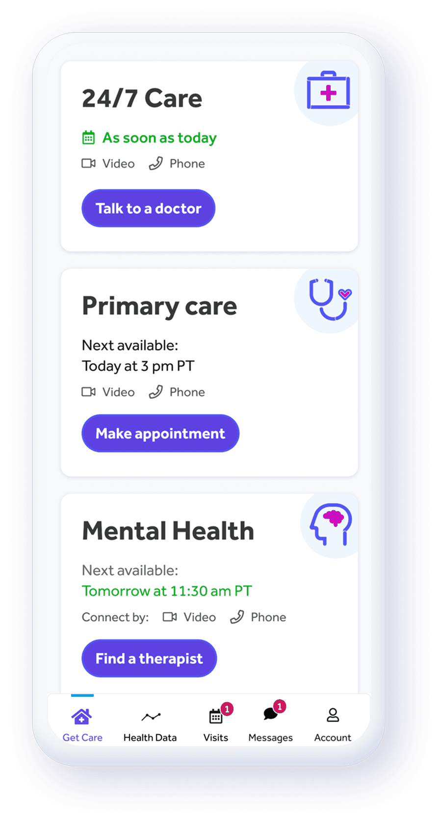
The new UI had many tight spaces where full illustrations wouldn’t fit, but the default icon set felt too generic. The graphical treatment gave us a middle ground. Lightweight enough for small components and expressive enough to carry the brand.


Accessibility Testing
In healthcare, strict contrast standards aren’t optional. To meet compliance and avoid costly accessibility violations, I adjusted line weights and color values across the icon set. Every icon was tested to pass AA and AAA contrast requirements while still preserving the visual style and brand expression.


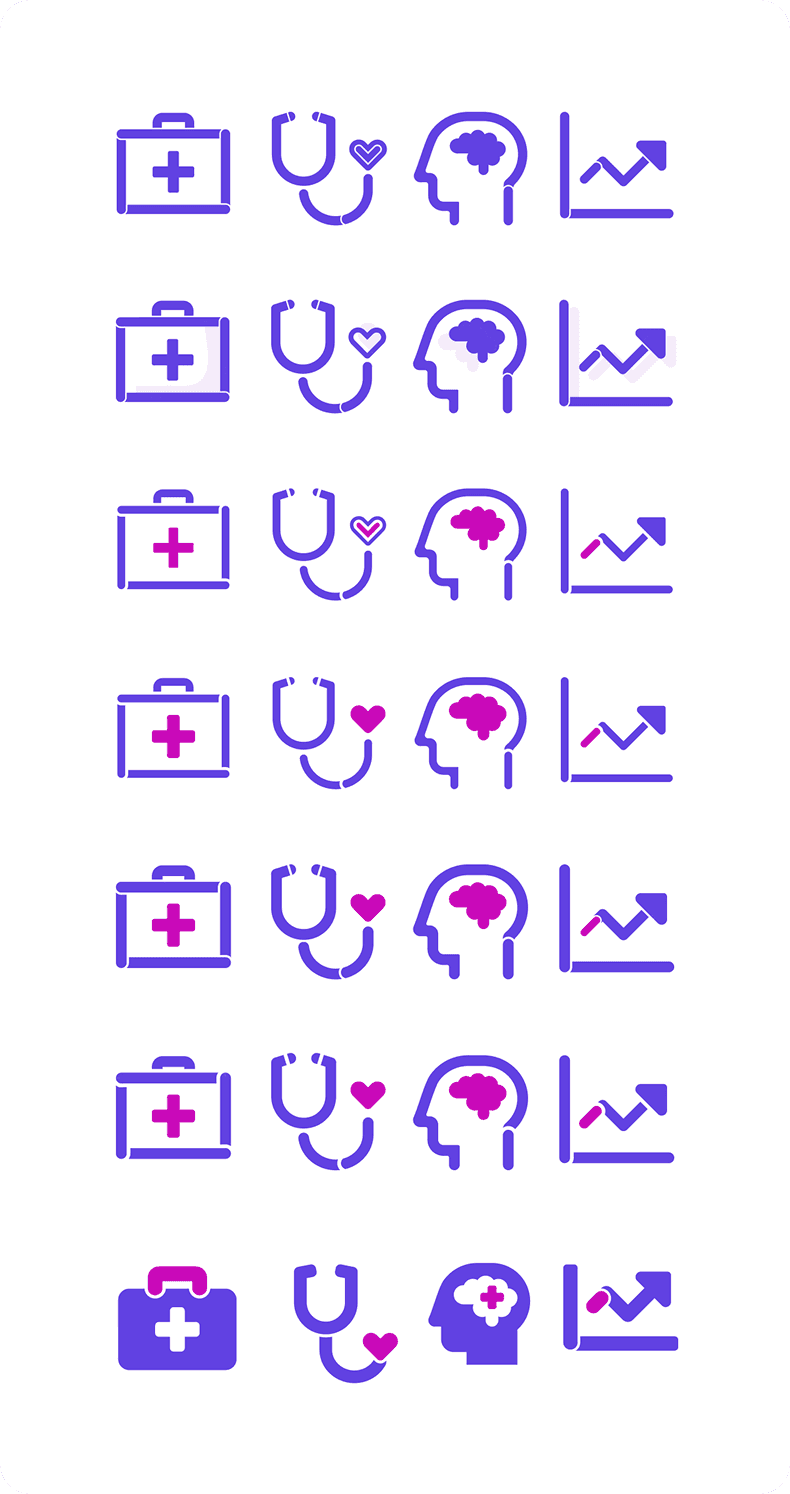
The Final Set:
I explored various weights, shapes, and color treatments to find a style that balanced clarity in small sizes with enough personality to feel distinctly Teladoc. The finals were flexible, brand-aligned, and readable across every surface of the app and web app.

Impact:
I created the Teladoc app's first custom illustration and iconography libraries, replacing generic stock assets and elevating trust, warmth and clarity across the experience
I built and tested accessibility-compliant visuals (AA/AAA), reducing legal risk and improving usability for patients across all health conditions
Improved cross-team alignment by bridging product, brand and marketing, helping the organization rally around a shared visual direction
I established micro-UX patterns (loaders, animations, states) that made the new brand feel alive and consistent throughout the product
Learnings:
Rebrands at a global scale are complex. Navigating taste, opinion, and ambiguity is a challenge in it's own right. I learned how to champion multiple valid design paths, then lead teams toward the one that best served our users and business.
Rebrands are much more than visual makeovers, it influences how users emotionally interpret the product. Confidence and clarity matter as much as aesthetics.
Rebrands also give opportunities to improve lacking pieces of the experience
With design… there is rarely only one “right” direction. I learned how to further explore multiple valid paths, synthesize feedback and guide teams toward the option that best served users and business goals
Strong foundations matter early. Building illustrations, icon sets and micro-UX systems upfront saved time and last min scrambles, reduced fragmentation and made the product more scalable.
Healthcare design carries unique responsibility. Compliance, clarity and accessibility are never “nice to haves,” and shape safety, trust and legal risk.
Go Back Home

Thanks for Looking!


